State of the Apps 2020
The smartphone software I’m currently using, why I’m using it, and how it helps me in my day-to-day life.
JOHN NICHOLS
APRIL 10, 2020
Our smartphones are an intimate look into who we are, the things we care about, and our personalities. Though there are millions of devices out there, we all have different priorities and uses for them, and the apps we use vary wildly from person to person. Taking the State of the Apps concept from CGP Grey and Myke Hurley at Cortex, let’s look at the apps I’m currently using.
Looking back to this time last year, I realise I’ve made big changes to how I use my smartphone. In an effort to reduce the amount of time I waste on social media, games and the like, I’ve reworked both the way it looks and how I use it, and whilst I still love sites like Reddit and YouTube, when it comes to using my smartphone as a productivity tool rather than a time-sink, I’ve come on leaps and bounds.
Since mid-2019, I’ve been using a Samsung Galaxy A50. It’s a decent mid-range offering with a much better camera than others in this price range – it’s what I use to take all the pictures for this blog!
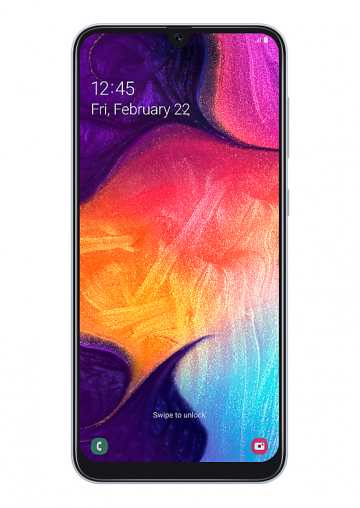
Before getting into what apps I’m using, let’s start off with my home screen:
Home Screen
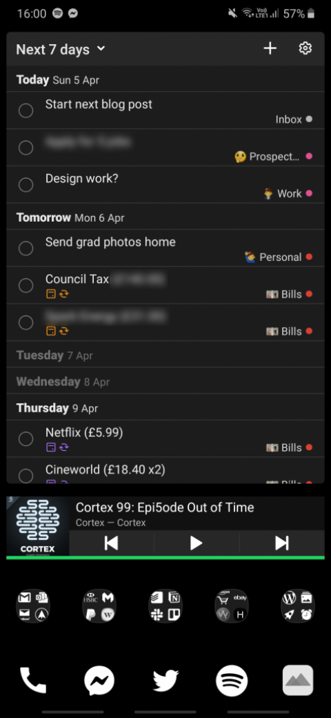
Yes – it’s very monochromatic! I tend to use dark mode in as many apps as I can, so I translated this approach to my home screen as well.
To achieve this look, I use Nova Launcher for the general layout, and Whicons for the all-white app icons. Coupled with a pure black background, it’s a function-first, easy on the eyes aesthetic.
Now for what takes up the majority of my home screen – the Todoist widget. I started using Todoist in January, which replaced ColorNote as my main note-taking app – I’ll discuss it in more detail in a bit.
Below this, I have the Spotify widget. Whenever I’m travelling to and from work or popping out for groceries, I’m usually listening to a podcast, and having the widget on my home screen is a lot more convenient than tabbing in and out of the app.
Going to the bottom, and to the three up-swipes. The left and right ones are as standard – the ‘back’ function and ‘open apps’ display respectively. The centre swipe returns me to the home screen (as standard also), but if I’m already on the home screen, it opens Chrome, my web browser of choice. This means it doesn’t need to take up any additional home screen real estate, giving me an extra space for a folder.
Speaking of the home dock, it’s pretty self-explanatory. I use Messenger as the main way to text friends, with Phone and Spotify present for ease of access.
Rather than having an app drawer icon on the dock, I reach my drawer by swiping up from the dock itself. This frees up a space for Twitter, which I primarily use for getting in touch with those who inspire and motivate me rather than as a mindless scrolling machine, which is why it is the only social media app I can open with a single tap.
The icon on the right-hand side might not be as easily recognisable. This is Moodpath, and I’ll go into further depth on it below.
This brings me onto the final part of my home screen – the folders. From left to right, the folders are organised as follows; email, finance, organisation & teams, shopping & articles, and a miscellaneous group for often-used apps, such as Gallery, Wordpress, AMdroid (which I’ll get into below) and my Reddit browser of choice, Boost.
As you can probably tell, I take a very pragmatic, functional approach to my home screen. Everything is laid out in a logical format, all the gestures feel natural and make sense visually, and the apps I use most often are no more than two gestures away.
You might notice that there’s no games and only one social media app on my home screen. In the last couple of months, I’ve kicked the habit of playing mobile games, and when I do need to use Instagram or Facebook for example, I just head to my app drawer. This avoids me making a mindless decision to open a social media app ‘just for a second’, which inevitably leads to spending an hour looking at cat memes (at least for me anyways), instead of using my time in a more productive manner.
Now onto the apps themselves. I’ll skip the obvious ones (social media etc.) and will hone in on the ones you’re probably not as familiar with.
Productivity

I use Todoist for pretty much everything; from shopping lists and note-taking to bill reminders and organising my workflow. It has so much flexibility in its use that I honestly think that everyone can find a way for it to work for them, and since I started using it an January, I’ve seen a marked increase in both how organised I am and how much I get done on a weekly basis.
As you saw with my home screen, the app also has widget functionality. I always have my home screen widget set to the ‘next 7 days’ layout. This lets me see not only what needs to be done today, but what tasks I have coming up that I could prepare for. The widget also allows me to add tasks directly, rather than having to go into the app, making it a really efficient tool if I have a brainwave and need to get an idea down.

For communication within work and project teams, Slack is my app of choice. Having a dedicated internal communication tool is far easier than using emails, and its functionality and ease of use make it an essential tool whenever I’m involved in a multi-person project.
Slack isn’t just a messaging app though – it has a very powerful API which allows you to sync functionality to other apps, such as Trello. It also has the ability to allow multiple people to work on an email draft at the same time – a great tool for those crucial messages! Speaking of Trello…

When it comes to tracking tasks Kanban-style, there’s nothing better than Trello. For both short-term and long-term planning, Trello is a brilliant way to organise your priorities whether they be personal or work-related.
I’ve used Trello on a semi-regular basis to track my medium and long-term projects, such as setting targets and tracking progress in my hobbies. I’ve also used it to road-map design projects for clients which I can share with them. Being able to show a client an effective to-do list and priority chain, as well as how far along you are at the moment, is a great way to keep them in the loop without an endless stream of messages or emails.
Trello is extremely flexible and, like Todoist, the deeper you dive into it, the more you realise its potential. For example, active due dates are great for hitting your deadlines, whilst Google Drive integration means you can access your board and the key task files you need from anywhere.
When it comes to managing email, I use four separate apps (I know – it’s a lot). Rather than compiling them all into one, I physically (or virtually, I guess) siphon work emails, design emails, personal emails etc. to different apps. This helps when I get a notification, as the app icon alone will let me know roughly what it is about, and therefore whether it’s something that needs to be dealt with immediately, or something I can look at later.
My professional and website-related emails come through Spark, which is by far my favourite email app, and one which I may filter all my accounts through in future. Rather than a standard ‘see all’ inbox, Spark intercepts all incoming mail and categorises it for you, meaning the most critical emails are pushed to the top, whilst newsletters, spam and other mail are filtered into a separate category. Spark also allows you to set up reminders – have you not had a reply to that important email for three days? Spark will let you know and notify you to chase it up. It’s a fantastic way to keep on top of your inbox, and I’ve yet to find a better solution thus far.
Finance

Fintech banks are all the rage nowadays, and Monzo is the one I use for 95% of my day-to-day transactions. I was skeptical of just how much more beneficial Monzo would be over a typical high-street bank, but the level of control I have over my money using Monzo is above and beyond anything I’ve used to manage my money previously.
I moved my everyday transactions to Monzo in September 2019, and I regret not doing so sooner. Simple ideas like instant spending notifications make it easier to track your budget, and should you allow your salary to be paid into Monzo (which I don’t, but it’s a nice feature), they can give you access to your salary 24 hours early. Monzo also includes automatic round-up savings pots, as well as an automatic budget calculator, which will tell you if you’re on track to hit your goals.
The customer support is fantastic also – there’s a in-app chat service that connects you with a real person to answer any questions or queries. If you’re looking for a modern banking experience, look no further than Monzo.

Speaking of finance apps, for my savings/investment money, I use Wealthsimple. Like many of these auto-investment apps, you take a survey, it recommends a level of risk, and then your money is automatically invested into a range of stocks and shares.
One thing that has really shines with Wealthsimple is their customer service, which I’ve had personal experience with. I had an issue with my account a few months back, and not only did I get a very rapid reply, but they rectified the issue and even waived the standard fees for the transaction I was trying to make.
The fees are not too bad either – your first £100 of trades are fee-free, and they take a very small percentage after that, compared to similar services. Whatever your level of risk, if you want a simple, no-hassle introduction to investing with wonderful customer service, Wealthsimple is a fantastic option.
Others

Moodpath is a mental health app which asks you various thought-provoking questions at multiple points throughout the day. It then takes your answers and presents them graphically, allowing you to track your overall state of mind. I had used Moodpath fairly regularly a year or two ago, and having now gotten back into the habit once again, I have found it to be a great way to track the ups and downs of my mental health.
After 14 days, Moodpath gives you an assessment of your answers, and what mental state you may be in at the moment. It also gives you a report which can be handed to your GP, allowing a professional to give you a better diagnosis. For just a couple of minutes of your time per day, Moodpath can really help you to understand your own mental health and habits a bit better, and it’s something I recommend everyone should at least give a go.

Earn rewards just for walking? This is the premise for Sweatcoin, an app which tracks your steps and converts them into a virtual currency, which can be redeemed for exclusive offers, trials and products. These range from subscription services and cosmetics to round-the-world trips and cash-out options.
I’ve been using Sweatcoin for a number of years now, and I’ve found it a useful tool not just for counting my steps, but also for motivating me to move more often, whilst earning the odd treat here and there. It’s been one of the first things I’ve downloaded on any new handset for the last few years, and hitting those step targets has become a daily habit.
The ability to see how many steps your friends have achieved recently is a brilliant way to ignite your competitive side – there have been a few occasions where I’ve seen that my friends have achieved more steps than me, and I’ve taken a longer route home, or simply gone out for a walk.
More than any app I’ve used before, Sweatcoin has made me more active, and, in a very small part, has made me healthier, making it, to me, possibly the most valuable app I’m currently using.
In the past, I’ve had trouble waking up in the morning. I’d either turn the alarm off and go back to sleep, or I’d simply sleep through it. Changing alarm tones every two weeks or so was the only way to make sure I’d get up on time, but this seemed like a needlessly complex solution to a simple problem, not to mention I’d often forget to change my tones over too late to avoid oversleeping for a day.
Enter AMdroid, an alarm app I’ve been using for over three years now. The main benefit is that it allows you to set super-annoying alarms. As an example, I have my morning alarm set up so that I need to duplicate five randomly-generated alphanumeric codes, roughly 8-10 characters each, before the alarm will turn off. This is usually enough to kick my brain into gear, but just in case, to prevent me going back to sleep after this, it will also push a pop-up notification to check that I’m awake a few minutes later. If I don’t dismiss this within 60 seconds, the alarm will go off once again, and the cycle repeats.
Aside from going into the app settings and disabling the alarm entirely, the only way to deal with this is to get up and stay up. All of these settings are handled natively through the app, and it has virtually eliminated days gone by where I would wake up at 1:00pm in the afternoon. If you have difficulty getting up in the morning, I couldn’t recommend this app more as I’ve now been able to stick to a regular routine for the best part of three years, and I feel much better for it.

Ever since Reddit’s recent update added profile pictures to the comment section, I’ve been looking for a third-party browser to give me a cleaner, more streamlined experience. After trialling out several different options, Boost has come out on top. Boost has a plethora of customisation options, not just for colours, but also for post layout, feed layout and more, allowing you to make Reddit look exactly how you want it.
I’ve also found that the app makes it much easier to get to the content you want to see. Whenever you perform a search, it gives you three options; to search for posts, subreddits or users. This means you don’t have to use the typical r/ or u/ in your search terms. It’s just a little quality of life improvement, but it’s one of the many little things which makes this app so great.

A great app for keeping in touch with all the latest news from the watch world, Watchville compiles the latest articles from dozens of the top websites, reviewers and influencers, and presents them in a logical, user-friendly format. It also has a ton of customisation options, so if you only want to see the latest articles or videos from a certain site, it can do that for you.
I check Watchville daily, and I use it for all of my watch news, apart from…

Their app first released for iOS in 2015, but only just came to Android last month. Pulling together all of their articles, videos and podcasts into one place, the HODINKEE app is a fantastic way to get your daily dose of high-quality watch-related content from some of the top journalists in the industry. The app also includes access to the HODINKEE Shop, stocking the finest new and vintage watches, cameras, sunglasses and more, giving you a modern, luxurious and safe buying experience wherever you are in the world.
It wouldn’t be a watch app without a way to accurately sync your timepieces, and as such, the HODINKEE app includes a GMT clock in both analog and digital formats, showing figures down to 1/10ths of a second. This is something I use on a regular basis to accurately set my watches, and is a great little addition to this highly-polished app.
Overall, I’m pretty happy with how I’m using my smartphone at the moment. Thinking back at the amount of time I used to spend on my phone playing games, scrolling through social media or spending entire days on YouTube, I’m glad that over time, I’ve changed my habits and started using my devices in a more mature manner.
It’s pretty easy for smartphones to consume all the hours of your day, but by approaching your smartphone in a different way, you can still maximise the positive impact whilst limiting the negative. Taking an holistic approach to how I use my devices has definitely helped be to become more productive, and compared to years gone by, I do think that by cutting down on my negative smartphone use I’ve become a happier person in general.
Are there any changes I’m looking to make? Aside from perhaps upgrading to the premium version of Todoist to get features such as advanced time-tracking, reminder notifications, and task prioritisation, I am content with my current software and the general way I’m using my smartphone.
Time will tell if I make any major changes. I will revisit the apps I’m using in January 2021, but in the meantime, the above apps are ones which I would definitely recommend, and I hope they might help you out as much as they have for me.
Published April 10, 2020.